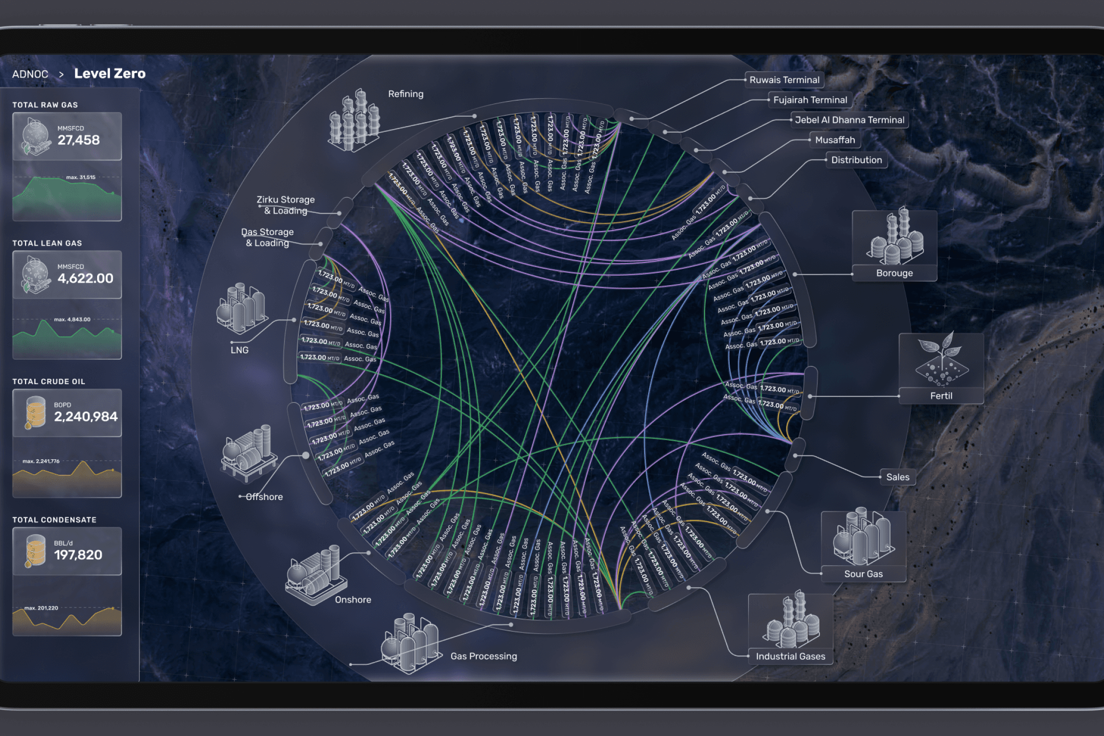
ADNOC, one of the world’s leading oil companies, operates a vast and complex oil production and distribution process. At the heart of this operation is one of the largest screens in the world, located at their headquarters, which plays a critical role in real-time data tracking. The screen provides insights into the entire oil production pipeline, enabling efficient management and seamless coordination of resources. Our work focused on enhancing their Real User Monitoring (RUM) interface, improving the usability and efficiency of the dashboard to ensure that real-time data is accurately visualized and accessible for critical decision-making.
Role:
Product Designer
Industry:
Energy
Client:
ADNOC
Key Points
Team size: 2
Departments solicited: UX/UI, Art Direction
My role: The team of the project was composed just by the Art Director and me. We worked together to "untangle" the previous screens provided by the client. I conducted the workshops and the co-design session with the client, following by the design of the user flows and the data hierarchy. The Creative Director took charge of the visual and aesthetic aspects.
Softwares: Figma, Miro, FigJam, Asana
Skills: UX Research, User testing, Wireframing, Co-Design
Challenges
Despite the technological capabilities of the screen, the current system suffers from an outdated user interface, which makes navigating the vast amount of information difficult and often overwhelming. The lack of proper information hierarchy leads to confusion, causing delays in decision-making and increasing the risk of operational inefficiencies. The goal of the project is to develop a user-friendly information system that can handle the complexity of ADNOC’s operations. This new system will prioritize a clear hierarchy of data, ensuring that key information is easily accessible.
Approach
Preliminary phase
The preliminary phase focused on understanding ADNOC’s existing information system and the hierarchy of data based on stakeholder priorities. It was crucial to analyze and comprehend the entire production and storage process, as well as the flow of information across the system. This allowed us to identify key pain points, evaluate how different types of data were being used, and determine which insights were most valuable to decision-makers. By aligning the information architecture with operational needs, we could lay the foundation for a more effective and intuitive system.
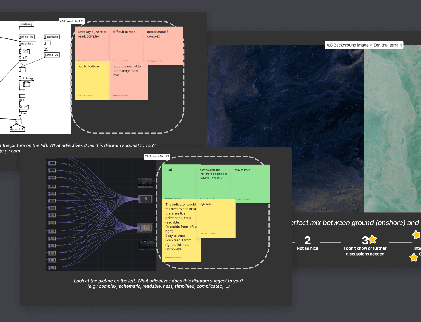
Co-Design phase
We conducted a series of workshops with ADNOC stakeholders to gain deeper insights into their needs and expectations. On one hand, these workshops helped us identify the most critical numbers to prioritize, ensuring that the new system’s information hierarchy aligned with their operational requirements. On the other hand, we explored their aesthetic preferences, striving to meet visual expectations as well. This collaborative approach allowed us to integrate both functionality and design, ensuring the final product would be intuitive, efficient, and visually appealing.
Design phase
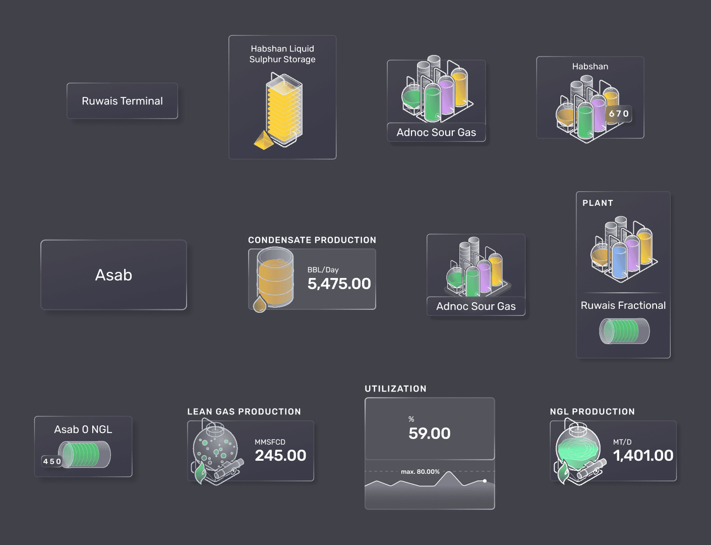
The design phase focused on creating four primary screens to cover a wide range of widgets, including alerts, data visualizations, KPIs, and operational flows. Our aim was to build a comprehensive design system that would allow ADNOC’s internal design team to easily develop additional elements in-house. This system included detailed guidelines for consistency in visual elements, interaction patterns, and information hierarchy, ensuring scalability and coherence across all future screens and applications.