The Triennale Museum stands as a beacon of cultural and design excellence in Milan and is internationally celebrated for its influence in the art and design world. As one of the city’s most iconic institutions, it has played a pivotal role in shaping contemporary design narratives. The challenge was to completely redesign the museum’s identity, encompassing not just the museum itself but also its theater, temporary exhibitions, and permanent collection. Our goal was to craft a refreshed and cohesive brand that would reflect the museum’s legacy while positioning it for a vibrant future, capturing the essence of its evolving role in the cultural sphere.
Role:
Graphic Designer
Industry:
Entertainment
Client:
Triennale di Milano
Key Points
Team size: 3
Departments involved: Art Direction, Graphic Design, Signage Design, Cultural Content Strategy
My role: I was responsible for developing the cohesive visual identity of the museum, spanning external and internal applications. I designed versatile and visually light solutions, ensuring the museum’s identity remained prominent while accommodating diverse exhibitions and activities. My work included creating adaptable graphic systems for banners, signage, and other visual elements, balancing consistency with flexibility to reflect the museum’s cultural mission.
Software: Adobe Illustrator, InDesign, Photoshop
Skills: Art Direction, Branding, Graphic Systems Design, Cultural Strategy
Challenges
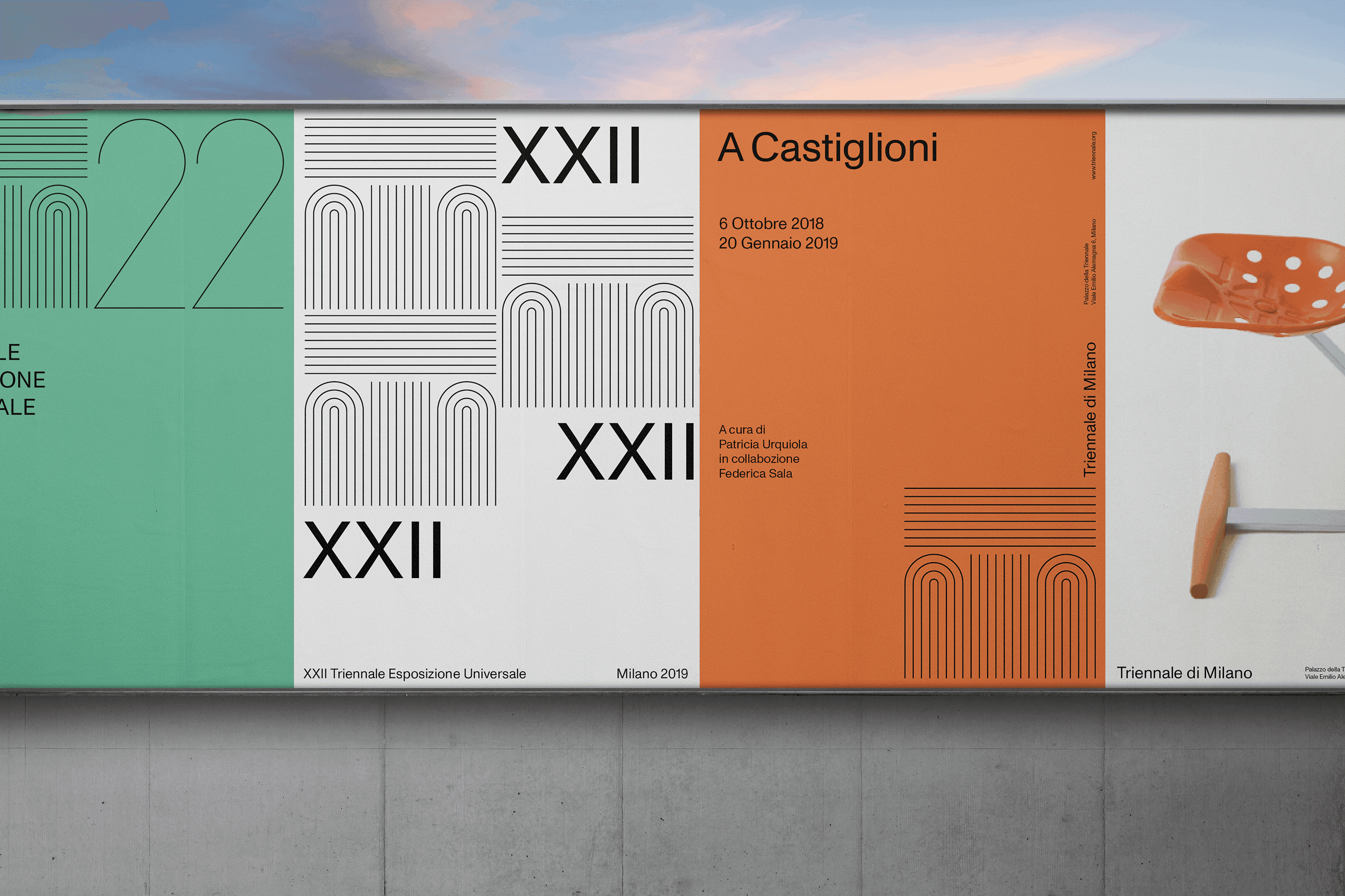
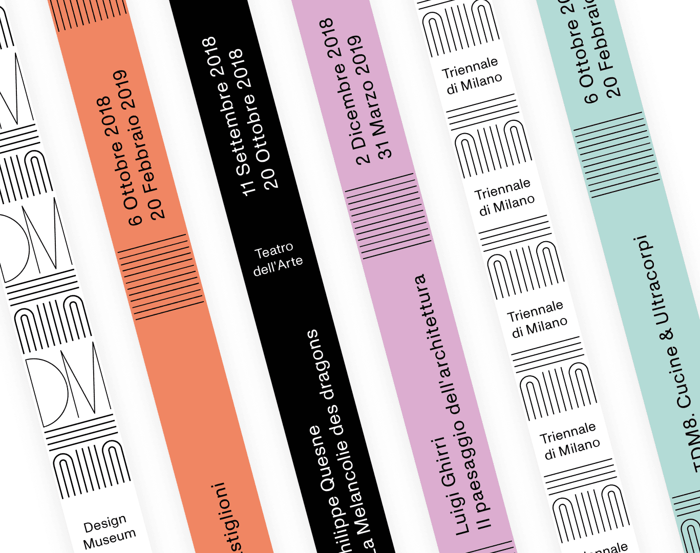
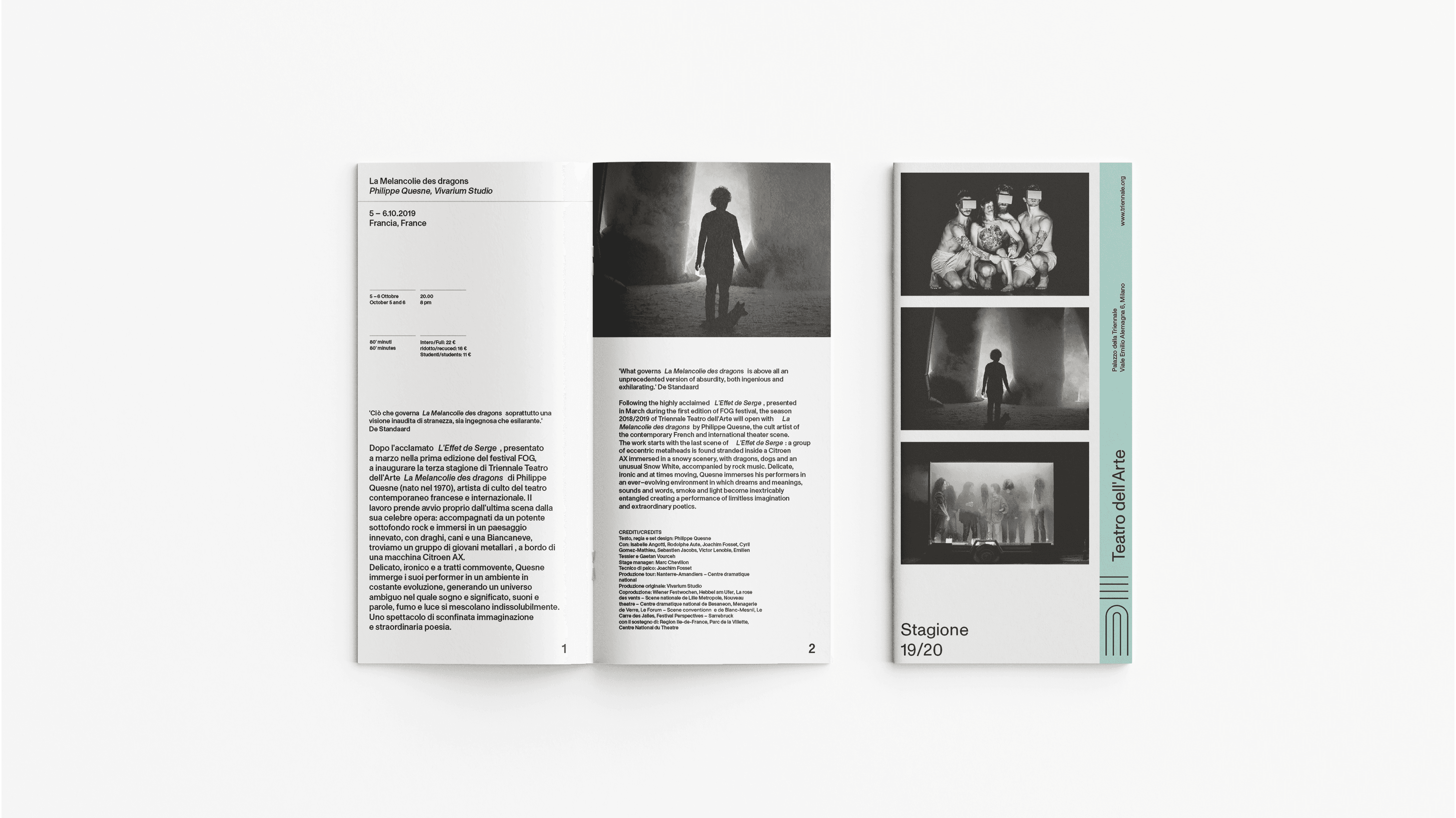
The main challenge of the project was to develop a cohesive visual identity that unites all elements of the museum, from the banners on the facade to the internal signage. The innovative and visually light approach was crucial, designing the museum as a dynamic container for a wide range of cultural content.
We envisioned the museum as a space that hosts other content while preserving its distinctive identity. This meant that the design needed to be versatile and welcoming, capable of integrating and showcasing exhibitions and activities without overwhelming the space. This balance between consistency and personalization was essential to ensure that every aspect of the museum reflected its cultural mission while remaining flexible and open to innovation.
Approach
Concept and Discovery Phase
We began by engaging with the museum’s team to understand their vision, brand identity, and the significance of the architecture. Drawing inspiration from the striking facade, we used the letters "T" and "M" for Triennale and Museum as the core of the logo. This minimalist approach was designed to reflect both the cultural importance and the contemporary feel of the space.
Design and Development
The logo became the foundation for the entire visual identity. We wanted to create a logo that fully represented the idea of "host". Not solid shapes, but strokes; no delimited elements but more flexibility. From there, we developed a cohesive system that extended to typography, color schemes, and other visual elements. We ensured adaptability across various mediums, keeping the design impactful whether it was scaled down for stationery or expanded for banners and signage.