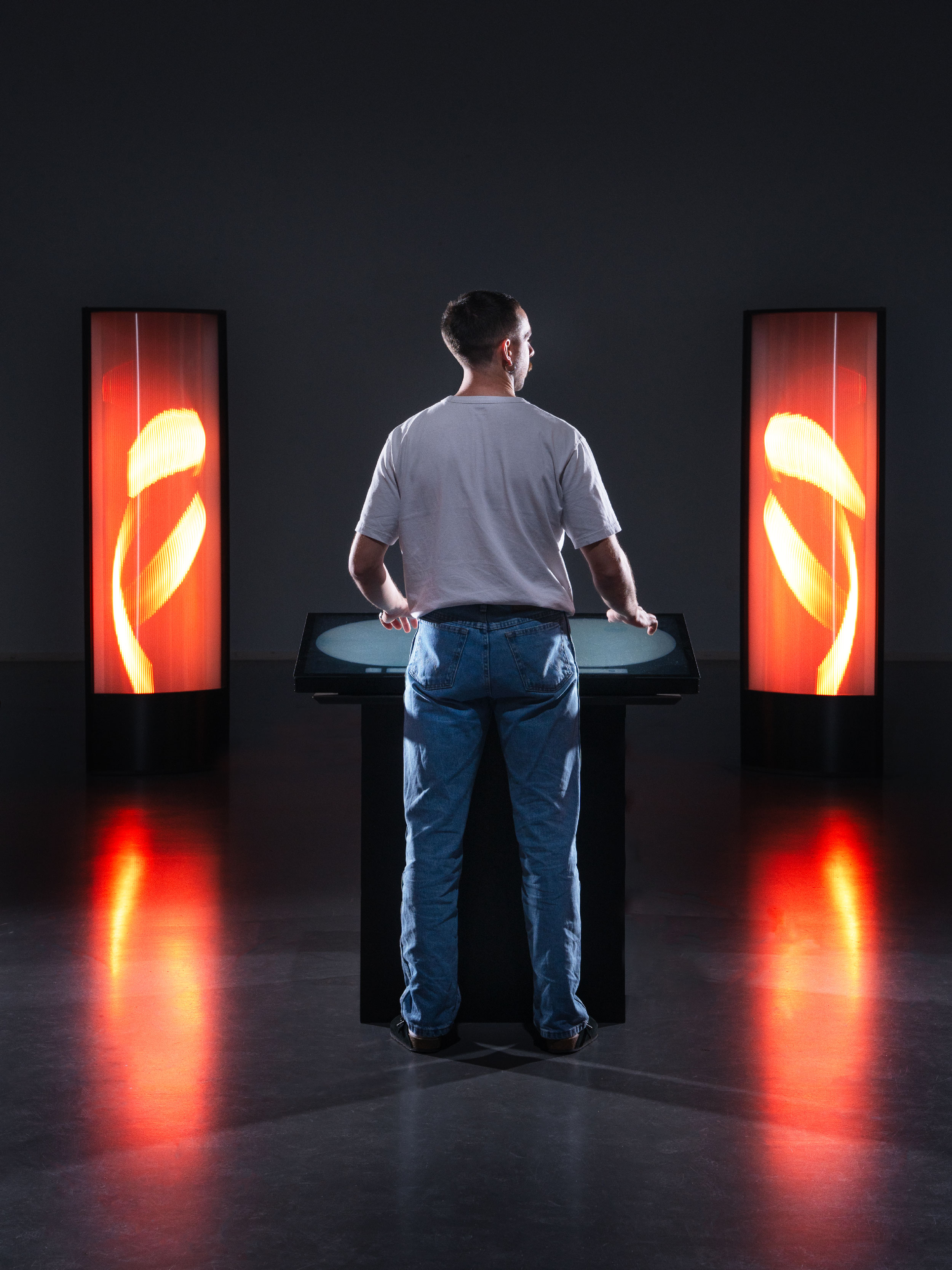
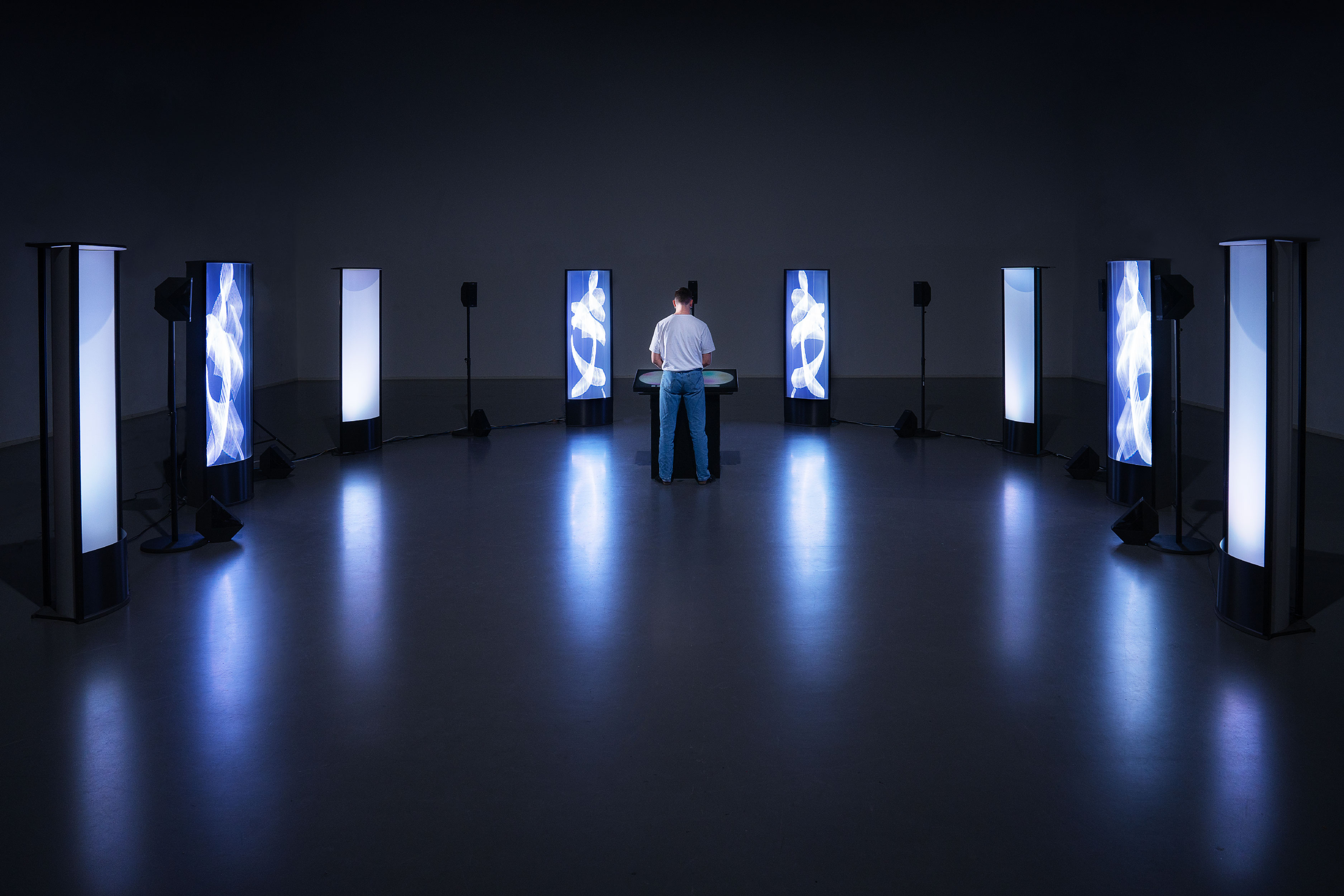
Praeludium constitutes a reinterpretation of the classical music listening experience. Utilizing digital innovations and immersive spatial audio technology, Praeludium aims to heighten engagement, especially among younger audiences. It transforms conventional performances into multi-sensory encounters by integrating audio-reactive visuals and dynamic lighting, thereby animating classical compositions. By crafting an immersive ambiance, Praeludium serves as a bridge between traditional and contemporary audiences, encouraging them to engage with classical music in stimulating ways.
Role:
Design Researcher and UI Designer
Industry:
Music
Client:
Radio Télévision Suisse (RTS)
Key Points
Team size: 6
Departments solicited: UX/UI, Software Engineering, Sound Engineering, Scenography, Art Direction
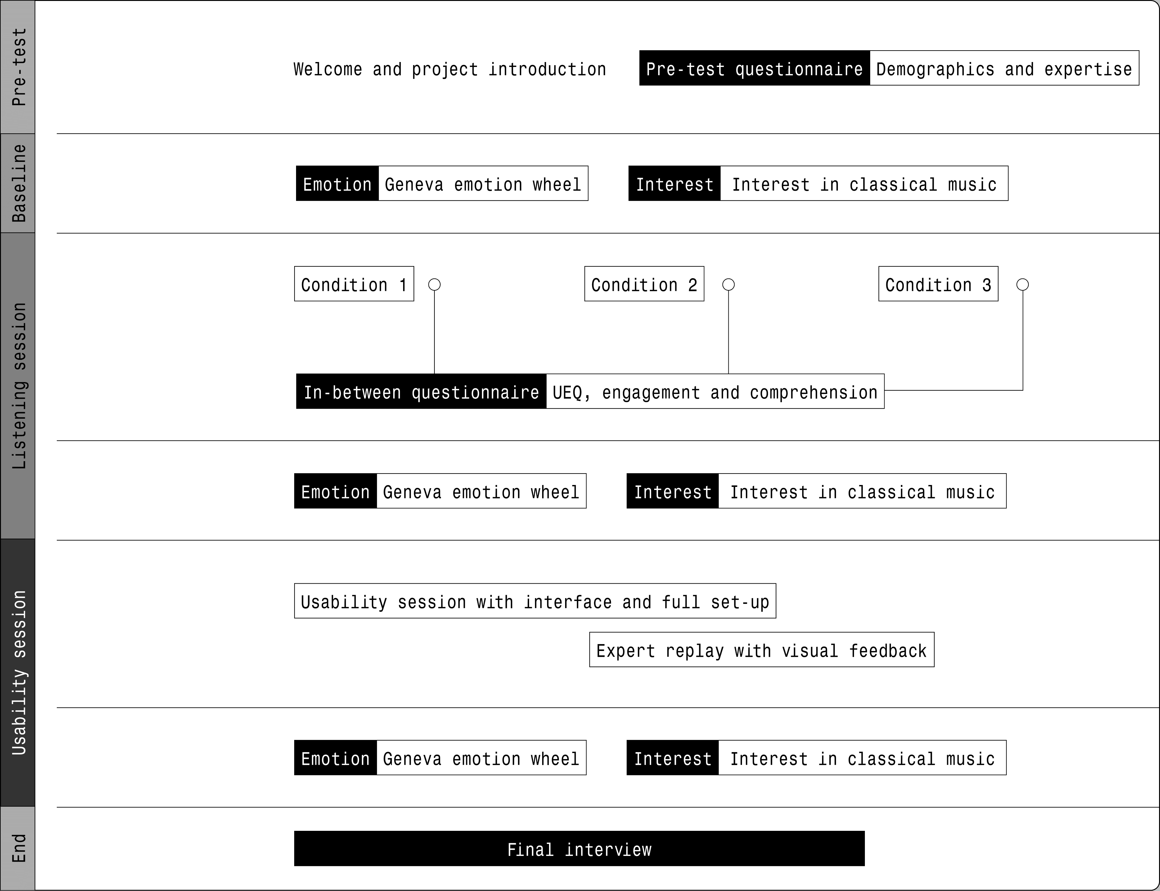
My role: I was in charge of the theoretical research, prototyping, and user testing. I conducted the user testing at the Lab, designing the scenarios and the research inquiry. I also analyzed feedback to refine the design and improve the interface — designed on Figma — and the user experience.
Softwares: Figma, Touchdesigner, MadMapper
Skills: UX Research, User testing, Wireframing, Data analysis, Prototyping, Agile methodology
Challenges
One of the main points we identified during the initial stages of the brief was the decline among classical music audiences.
As analysed in some reports, the attendance keeps declining in the whole world with peaks in Unites States and United Kingdom. And while the audience keeps ageing, there is no engagement for a new sector of public.
Approach
Preliminary Phase
The first phase was dedicated to the exploration of the subject. Firstly, starting with desk and on-field research. After summarising the basic theoretical points of the project, we continued with the creation of the first personas and user flows to verify the actual succession of actions and the logic behind each interaction with the process.
Foundations and keywords
Having identified the critical actions, and emphasised the most interesting ones, we went ahead, continuing on the operational level, and always using theoretical references to support our choices. We therefore wrote our research question that guided the entire project also from a physical point of view.
How does the visual representation of timbre, texture, and sound parameters, within the frame, increase the audience’s cognitive and emotional engagement with classical music?
The research question is directly based on the research gap identified both in the literature review and in the initial feedback discussed with the participants of the preliminary tests.
The research gap lies in the lack of practical experiments on enhancing the listening frame for classical music.
Design phase
The first sketches became CAD projects, the first ideas became screws and power chords. We started the actual construction of the installation, with the help of the RTS audio engineers. The design of the interface, the screen at the centre of the installation that allows the actual interaction between the user and the whole room and its adaptation, also began. The interface underwent several reworks and redesigns based on the feedback from the experts and preliminary users who tested the installation.


