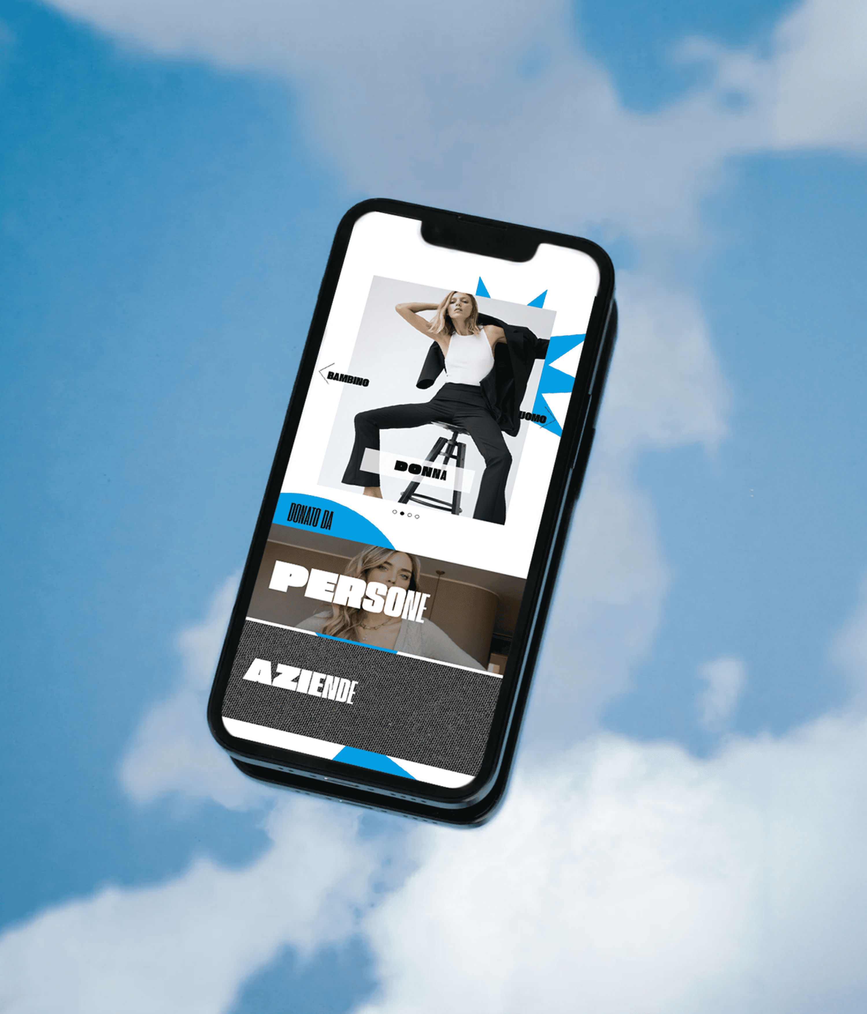
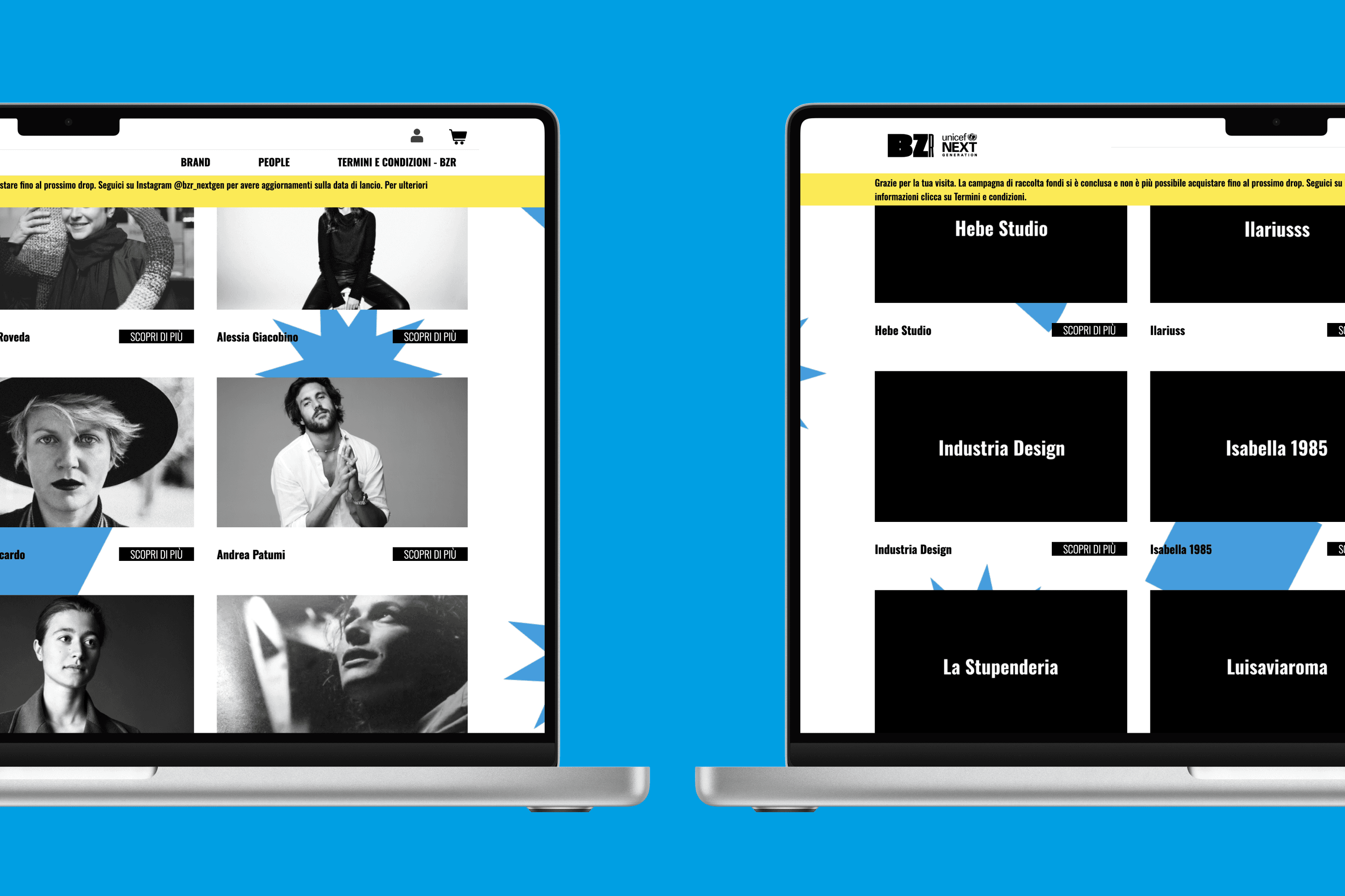
This temporary e-market, curated by the UNICEF, is designed to raise funds for children and adolescents worldwide. The platform offers luxury items, generously donated by individuals and companies, at accessible prices. Blending the principles of a circular economy with a charitable cause, Bazaar aims to appeal to socially conscious consumers.
Role:
Product Designer and Art Director
Industry:
Humanitarian
Client:
Unicef
Key Points
Team size: 3
Departments solicited: Product Design, UX/UI, Art Direction
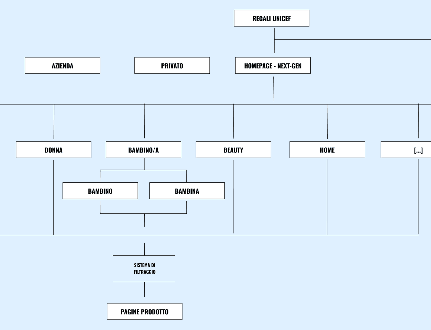
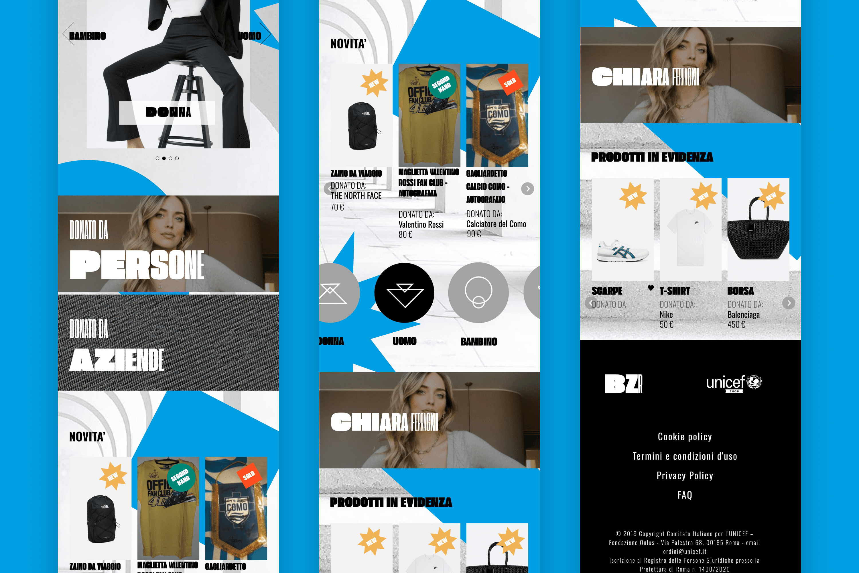
My role: I started developing the information structure after client meetings. Once defined, I designed the wireframe of the mobile screens — the website has been designed as mobile-first. I supervised the creation of the visual design of Bazaar and the UI component.
Skills: Art Direction, Information architecture, Wireframing, UI Design
Challenges
The challenge lay in creating a platform that would engage younger generations. While UNICEF has a strong international presence, the goal was to appeal to younger audiences increasingly drawn to sustainable fashion, vintage items, and the concept of doing good through their purchases.
I took care of the entire branding identity, ensuring it adhered to UNICEF's guidelines while infusing a fresh, youthful tone to captivate this demographic. The design needed to merge UNICEF’s established brand with the values of luxury, sustainability, and philanthropy.
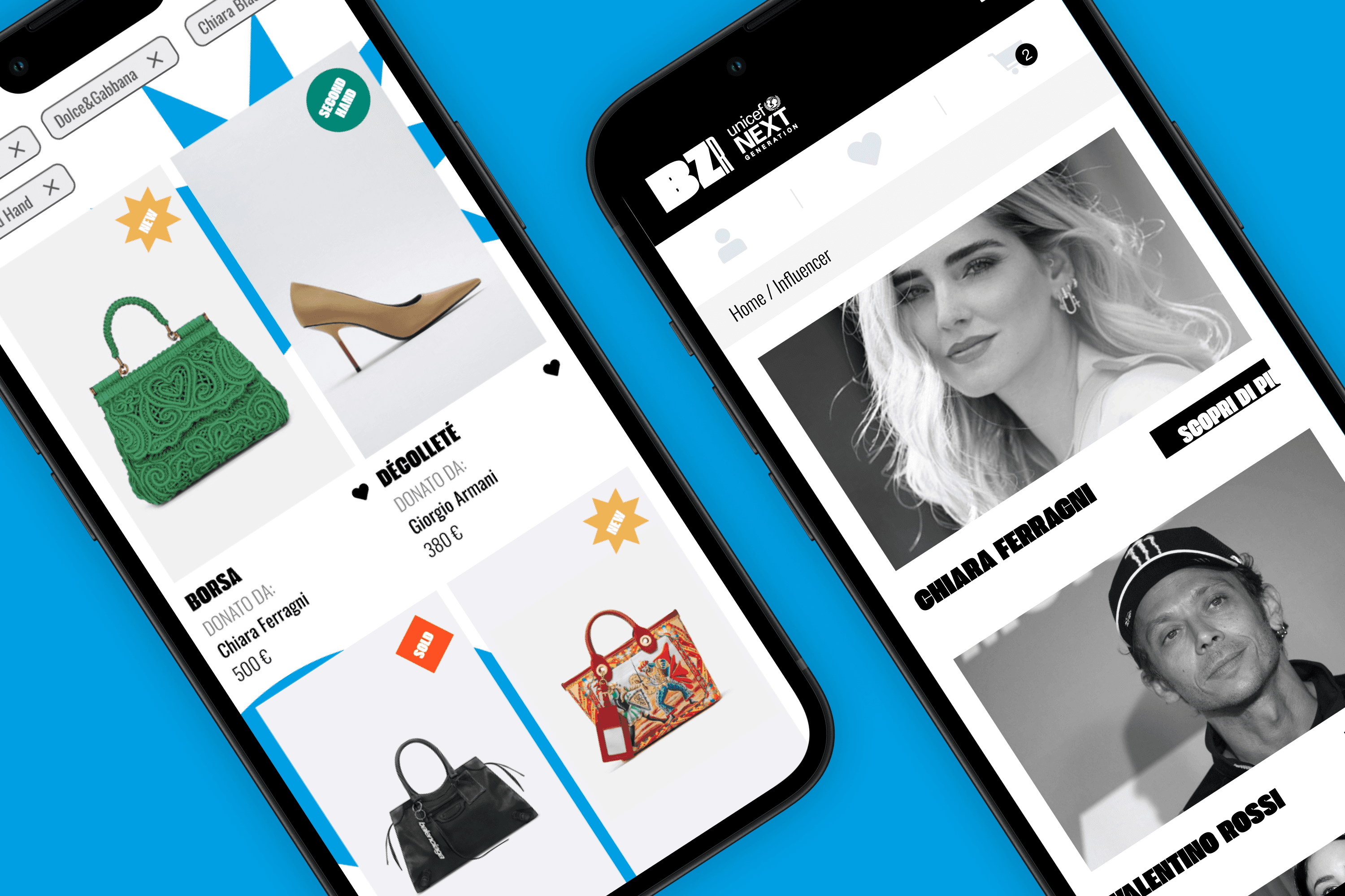
Our aim was to develop a dynamic and visually appealing e-commerce marketplace where people can purchase high-quality goods while supporting charitable causes. The platform was designed to offer an intuitive shopping experience that seamlessly blended style, purpose, and impact.
Approach
Audience-Centric Design
Our primary focus was to engage younger, socially aware consumers who are increasingly drawn to sustainable fashion and charitable causes. We designed a platform that seamlessly blends stylish, high-quality fashion with the opportunity to make a meaningful impact, ensuring that users feel both inspired and empowered by their purchases.Youthful Branding with Purpose
We carefully crafted the branding to stay true to UNICEF's core values while incorporating a fresh, modern aesthetic. The design aimed to connect with a younger demographic by merging luxury and sustainability with a sense of purpose, ensuring that the platform’s look and feel resonate with the values of today’s socially conscious shoppers.Intuitive and Impactful Shopping Experience
We created a user-friendly interface with an easy-to-navigate shopping experience that made it simple for users to browse and purchase items. The platform highlighted the social impact of each purchase, allowing users to understand how their support directly contributes to UNICEF’s mission to improve children’s lives worldwide.Continuous Testing and Iteration
Throughout the development process, we conducted regular user testing to refine the platform’s design and functionality. This iterative approach ensured that the interface remained intuitive, while also allowing us to optimize the user experience and ensure the platform was aligned with both UNICEF’s goals and the expectations of our target audience.

